On the stories we carry, the things we're drawn to, and why beauty is always more personal than it appears.
I've always been fascinated by what makes something beautiful. Not necessarily the kind of beauty everyone agrees on. I'm interested in the kind that makes you pause for a moment. Something that feels familiar, even if you can't explain why. A particular color, an unexpected combination of textures, the way a few seemingly unrelated elements come together and somehow make perfect sense.
I think beauty lives in the relationships between things.
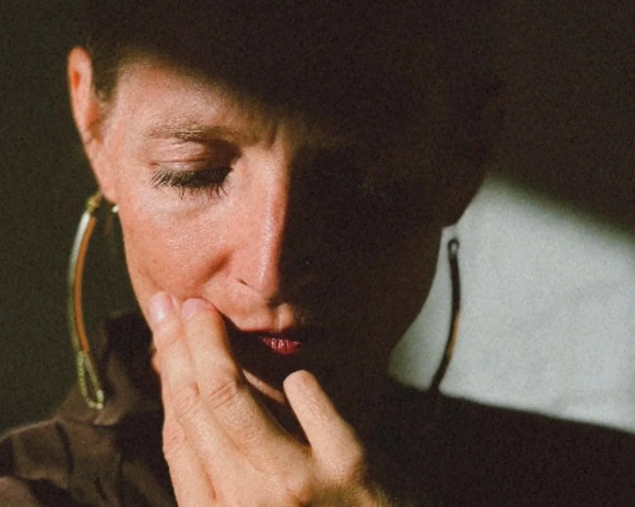
The way colors speak to one another. How an image gives context to a story. The feeling a typeface creates before you've even read the words. The contrast between something strong and structured and something soft and delicate.
I love when those contrasts exist together. A bold, masculine typeface paired with a color palette that feels gentle and romantic. Something a little rough beside something beautifully refined. The unexpected details that give a design its own personality. When everything begins to work together, you can feel it. And that feeling is what interests me most.
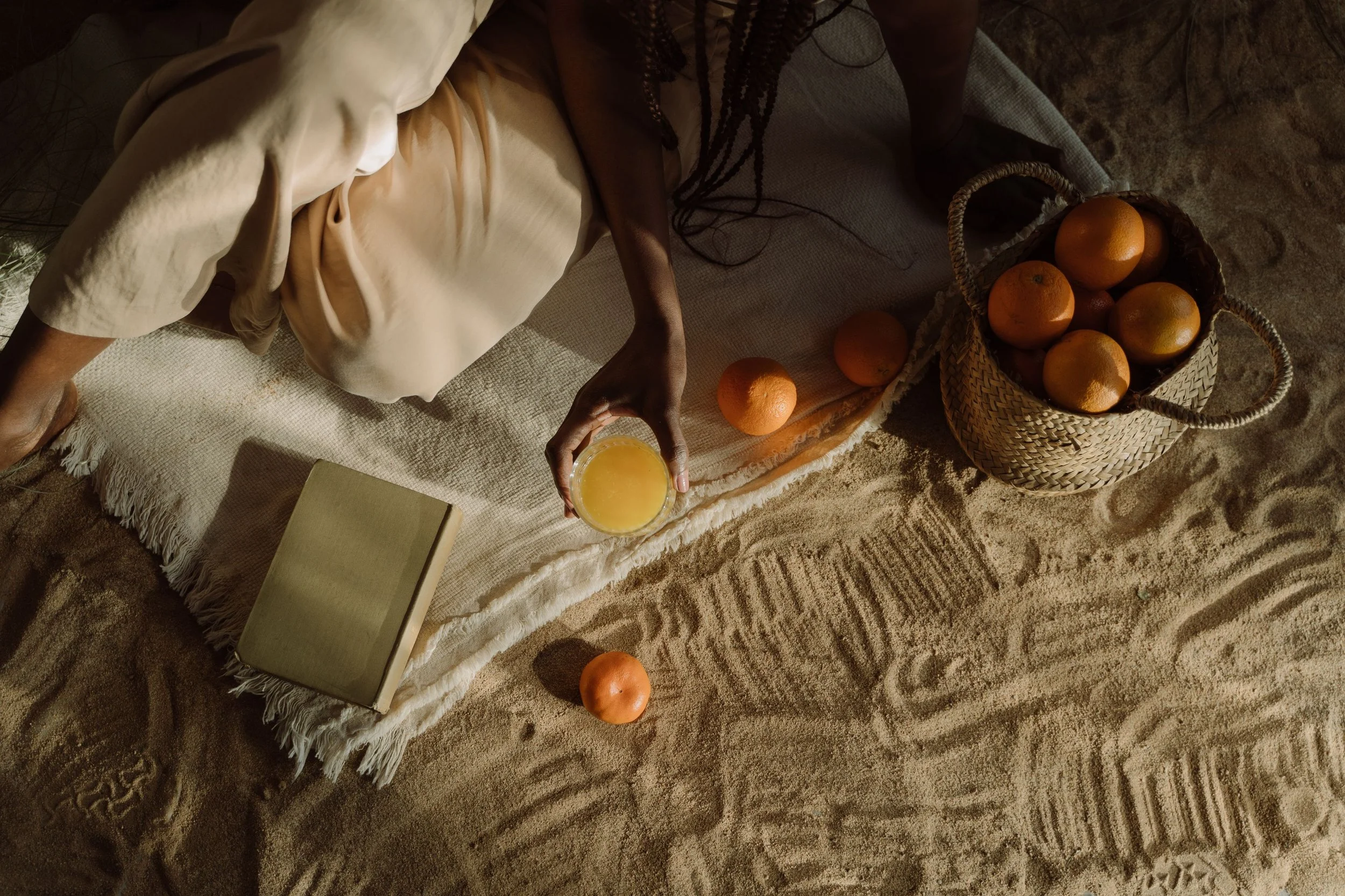
The stories we carry
I think our personal taste is much more connected to our experiences than we sometimes realize. We spend our lives collecting little associations with the world around us. Things that brought us joy, made us feel safe, reminded us of someone we loved, or simply stayed with us for reasons we couldn't explain at the time.
Imagine loving the color orange because a girl you admired in school loved it. Years later, you might still find yourself drawn to that color. You may not even remember where the feeling began. You just know that orange makes you happy. Someone else might see the same color and feel something entirely different.
I find that fascinating.
The things we're drawn to often have histories of their own and sometimes, the most meaningful design decisions begin with stories nobody else knows. A particular shade might remind you of your childhood home. A texture might bring back the feeling of a place you once visited. A certain style of typography might express a part of your personality you've always loved but never quite known how to describe. These details can become part of the visual world of a brand.
Your customers may never know the original story behind every choice and they don't necessarily need to. But there's something special about creating from a place of personal meaning. It gives the work a depth that can't always be explained by looking at it.
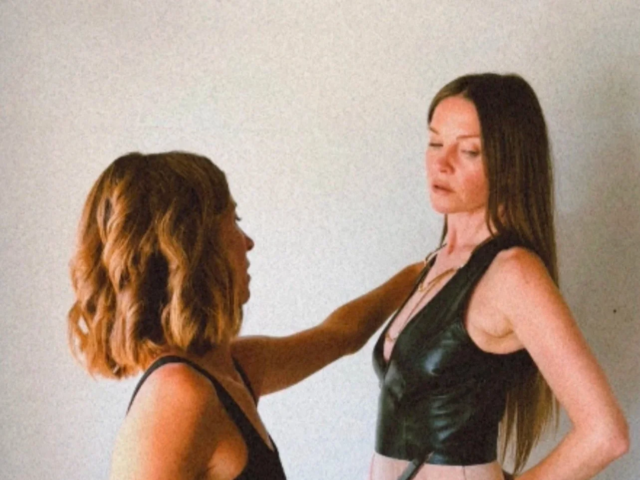
A brand has a character of its own
One of my favorite parts of the creative process is getting to know the person behind a business. I want to understand what they love. What they're drawn to. The things they notice that other people might overlook. I'm curious about the decisions they've made along the way and the experiences that shaped their perspective. Because I believe the character of a business begins long before its visual identity is created.
It's already there in the founder's personality, their values, the way they approach their work, and the experience they want to create for others. My role is to pay attention to those things, to notice the common threads, to explore what feels true and to help bring the character that's already present into a more tangible form.
I think that's why I've never been especially interested in creating something simply because it's trending. Trends can be fun, I enjoy them, too, but there's something much more interesting to me about discovering what makes a particular person or business distinctive.
I want to know what you would choose if you weren't thinking about what everyone else was doing. What would feel exciting to you? What would make you feel at home in your own brand? What details would you want to carry forward because they mean something?
Those are the conversations I love having.
When everything finds its place
Of course, meaning alone doesn't create a cohesive brand. There's also the work of bringing everything together.
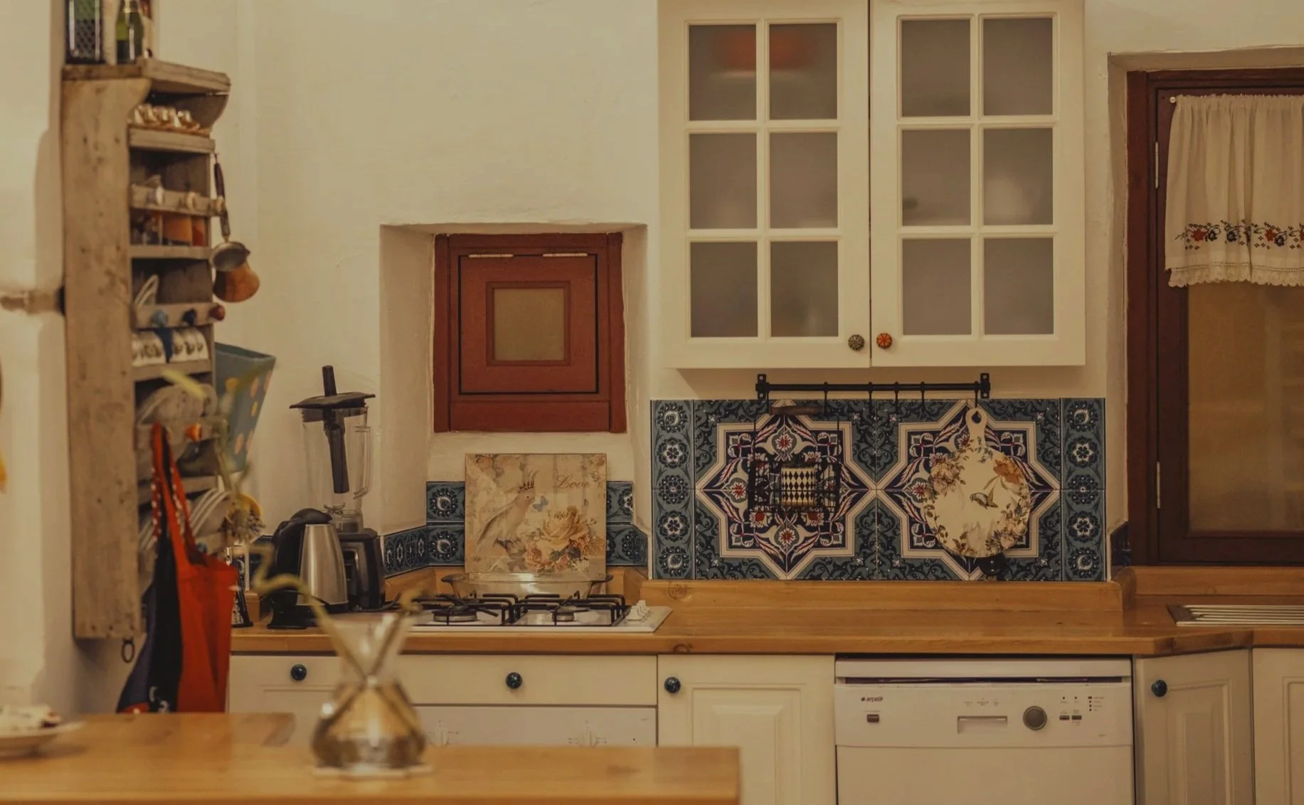
I think of design as a relationship between the practical and the intuitive, it's a little like creating a home. Before choosing the perfect tile for your kitchen, you need to understand how you want to use the space. Where the light comes in, where you naturally move, and what would make everyday life feel easier. Then you get to explore the materials, colors, and details that make the space feel like yours.
Branding works in a similar way. We begin by understanding the business itself. What it offers, who it serves, what matters most, and where it's headed. That understanding becomes the foundation for the creative decisions that follow.
And then comes the part I love: Finding the visual language that brings all of those ideas into harmony. The right typography. The balance of color. The way imagery and words create a particular atmosphere. The little details that might seem insignificant on their own but contribute to the feeling of the whole.
There's intention behind each choice, but I also believe there's room for intuition. Sometimes you know a combination is right before you can fully articulate why, you can sense when something belongs.

Making room for the unexpected
I've spent much of my life around artists, creatives, and designers, and one thing I've come to appreciate is that inspiration rarely arrives on command. Sometimes it comes through a conversation or it appears while you're doing something completely unrelated to work. It asks you to leave an idea alone for a little while.
I believe creativity needs room to breathe.
There are moments for structure and careful decision-making, and moments when you need to follow your curiosity somewhere unexpected. I've learned to respect both. Some of the most interesting creative choices happen when we give ourselves permission to explore beyond the obvious solution. To try the color that feels a little surprising and pair elements that seem like opposites. It’s trusting that something worth discovering might be waiting just beyond our first idea.
I think this is part of what makes design so personal. There are countless ways to express the same idea but the beauty comes from finding the expression that feels right for the person and the story behind it.
The beauty of being yourself
When someone comes to Alethea Studios, I know they're bringing much more than a business that needs a new visual identity. They're bringing years of ideas, decisions, risks, and experiences. Often, they've spent a long time creating something they care deeply about. They've learned what works, discovered what matters, and developed a clearer sense of where they want to go. I feel a responsibility to honor that.
I want the work we create together to reflect the care you've already put into building your business. I want you to recognize yourself in the finished design, perhaps even discover parts of your vision that you hadn't quite been able to express before. Because there's something wonderful about seeing an idea that's lived inside you for years begin to take shape in the world. It becomes something you can share, something other people can experience, connect with, and make part of their own lives. And the story keeps growing from there.
Maybe that's what beauty means to me, the feeling that everything belongs together, even the unexpected parts. The meaning we carry into the things we create and the possibility that, through design, we can give those quiet, personal stories a place to be seen.
With love,
Forest
Founder & Creative Director, Alethea Studios